The formatting tools for the Sunburst chart enable you to change the background color, sunburst titles, and miniature settings. With the Sunburst Chart selected from the Formatting panel dropdown list, you can configure the formatting options on the available tabs.
Sunburst Chart Formatting
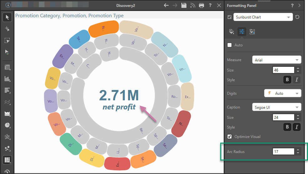
In this example, the font color, size, and emphasis were adjusted for both the measure and caption titles (purple arrow) and an Arc Radius that changes the individual tiles into lozenges (green highlight):
Fill
- Background Color: Change the color of the Report Background using the Color Picker tool. This change does not affect the chart background.

Settings
Sunburst charts feature two titles in the center of the visualization. The first title (the measure title) displays the total value of the measure chip in the Values drop zone; the second title (the caption title) displays the measure's caption.
The Settings tab includes options for adjusting the sunburst titles, which are located in the middle of the sunburst.

Basic
- Auto: use the auto settings to style the sunburst titles; disable this option if you want to make any changes.
Measure
- Measure: change the font type for the measure value title.
- Size: change the font size for the measure value title.
- Style: change the font style (bold or italics) for the measure value title.
Digits
Digit: this option is relevant only if no hierarchy is added to the Categories drop zone; in this case, the values will be displayed in the word cloud (rather than hierarchy members), and you can adjust the units for the values according to the following options:
- Auto: designated by the lightning bolt icon, Pyramid will automatically apply the appropriate formatting.
- Thousands: designated by the "K", values will be formatted in thousands.
- Millions: designated by the "M", values will be formatted in millions.
- Billions: designated by the "B", values will be formatted in billions.
- None: use the formatting configured in the database.
Caption
- Caption: change the font type for the measure caption.
- Size: change the font size for the measure caption.
- Style: change the font style (bold or italics) for the measure caption.
- Optimize Visual: the visual optimization engine in Pyramid is a heuristic that automatically redacts certain parts of a graphical visualization based on the amount of space provided.
Radius
- Arc Radius: apply a curve to the corners of the tiles used in your Sunburst Chart. Where the radius is 0, the tiles have angled corners. Increasing the radius adds a curve to the corners, making each tile into a lozenge shape. The larger your Radius is, the more pronounced the curve is.
Miniature
![]() Miniature Color 1, 2, and 3 set the text colors for miniature visuals, which appear automatically when a visual is scaled down due to legibility limits. These miniatures show measure values and labels for quick reading in limited space. Use the Color Picker to set the color for each miniature tile.
Miniature Color 1, 2, and 3 set the text colors for miniature visuals, which appear automatically when a visual is scaled down due to legibility limits. These miniatures show measure values and labels for quick reading in limited space. Use the Color Picker to set the color for each miniature tile.
Miniature visuals are created automatically when you scale a visual down to a size that makes its content illegible. These tiles typically display the measure as a number with its name underneath:
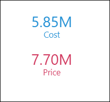
Note: The purpose of a miniature visual is to provide a way to easily view and interpret important data at a glance, even where there is a lot of information and limited space.